
Most documents on a public website are read. Forms are used — and that difference is the whole problem. A resident who cannot finish a permit application has not been inconvenienced; they have been locked out of a government service. Forms are the reason our highest remediation level exists, and this post explains what makes them the hardest documents you publish.
Why are forms the hardest documents you publish?
Because a form is an interface, not a page. A report needs a correct reading order; a form needs labels, focus, state, grouping, instructions and error recovery — the full set of interactive requirements that WCAG 2.1 applies to anything a person operates rather than reads. Most PDF forms were drawn as visual layouts first, so none of that structure exists, and all of it has to be added deliberately.
The stakes are also higher. Under the Department of Justice's Title II rule, a form in active use is squarely covered content — the exceptions for old documents explicitly stop applying the moment a document is currently used to apply for or access a service (ADA.gov fact sheet). Your oldest forms are often your most covered documents.
What does every accessible form field need?
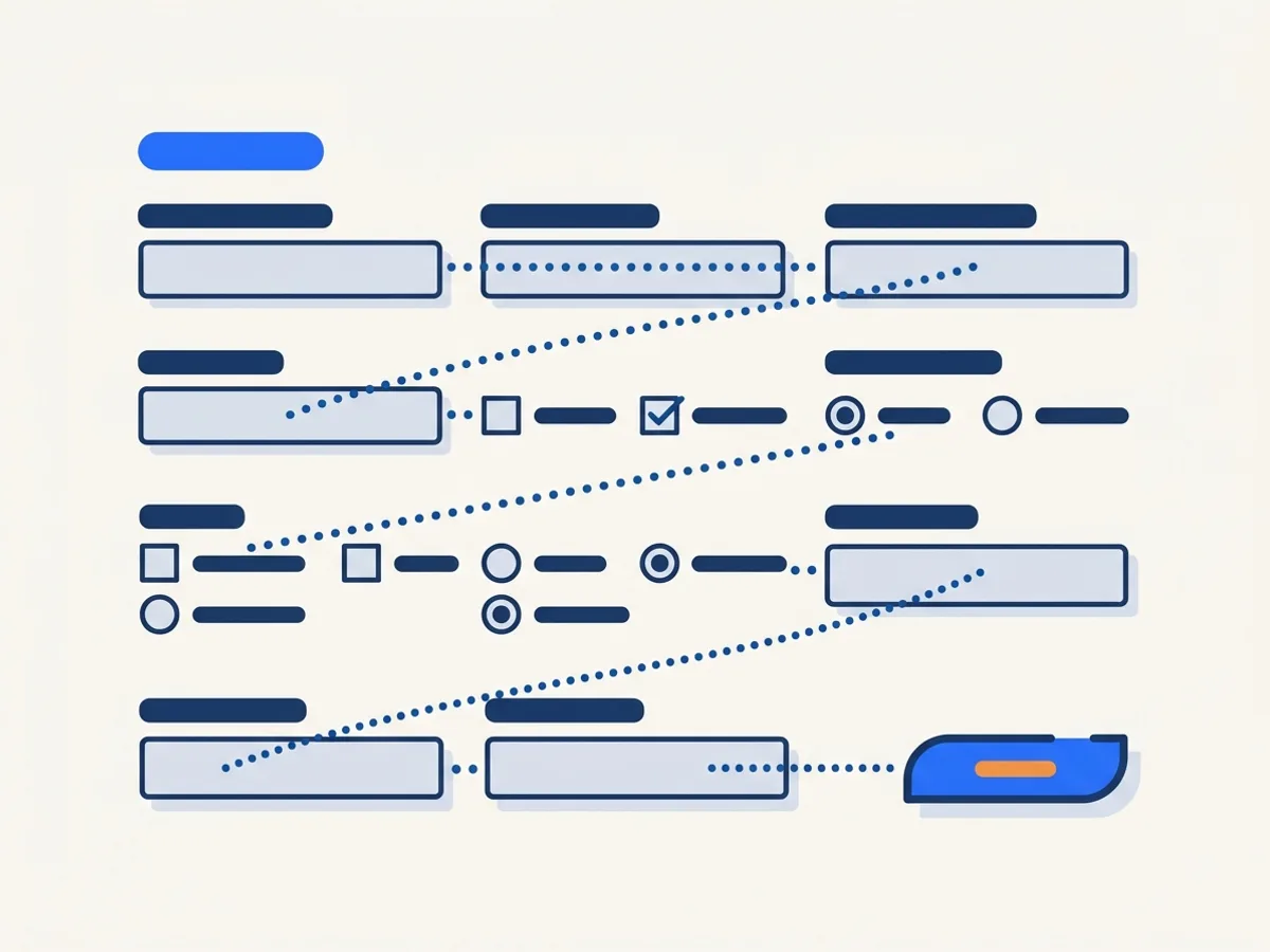
Four things, none of which a sighted glance at the layout will reveal as missing. First, a programmatic label and tooltip that carry the actual question: a screen reader user tabbing into a field hears its tooltip, so a field labeled "Text1" instead of "Date of birth (MM/DD/YYYY)" is a dead end. Second, a tab order that follows the visual flow — a two-column form that tabs down the page in creation order sends keyboard users ricocheting across sections. Third, programmatic grouping: five radio buttons are only "Yes/No for question 7" if they are grouped, otherwise each one announces as an orphan. Fourth, instructions in the right place — requirements and format hints tagged so they are encountered before the fields they govern, not discovered after a failed submission.
Concrete example: a building-permit application's "type of work" checkboxes. Visually, the heading above them explains everything. Programmatically, unless that relationship is built, a screen reader announces "checkbox, not checked" seven times in a row with no clue what any of them mean.
Another one, from the most common form on any public site: the records request. It usually has a free-text description box with its instructions ("describe the records, including date ranges") printed above as ordinary layout text. If those instructions are not tied to the field, a screen reader user lands in an unlabeled text box the size of a paragraph and has to guess what belongs in it — on the very form designed to guarantee public access.
Why do forms route to Level 3?
Because "mostly right" still locks people out. On a text page, one imperfect tag degrades the experience; on a form, one unlabeled field or one broken tab sequence can make the whole document impossible to complete. Automation does the structural preparation — building the tag tree, detecting fields — and then a human reviewer labels, orders and walks through every form before it verifies. That is what the 30-credit L3 tier pays for, and it is why the L3 threshold includes a mandatory human spot-check rather than machine scores alone.
Should you remediate the PDF or rebuild it as a web form?
Depends on use. If a form is completed more than a few times a month, a well-built HTML form is usually the better answer: easier to keep accessible, mobile-friendly, and it validates input at the source. Remediate the PDF when the form is rarely used, legally fixed in format, or must remain printable and signable as-is. A hybrid — web form in front, accessible PDF as the record — often satisfies both the residents and the records office.
How do you test a remediated form?
Complete it. Keyboard only, from the first instruction to submission; then again with a screen reader, listening to what each field announces. Automated checkers verify that labels exist — only a human run-through verifies that the labels make sense, the order is completable, and an error message does not strand the user at the bottom of the page. If you have hundreds of forms, test a sample this way and you will quickly learn which template generation to distrust.
Forms are where document accessibility stops being an abstraction. Get them right first — they are the documents residents cannot work around.
Topicsformspdfwcagremediation
About the author
Rakesh Patel — CEO & Founder
Rakesh Patel is the founder and CEO of DocoMatic and the founder of Space-O Technologies (2010), the engineering company behind it. He brings 32 years of leadership experience in business strategy, operations and IT, and has overseen the delivery of more than 3,000 software projects. DocoMatic applies that delivery experience to one specific problem: making public documents accessible, verifiably.